Scanning Photographs
The Scanner
Ctein in his book ‘Digital Restoration’ tells us that most of the time we don’t need a scanner that goes beyond 1200 ppi (pixels/inch). But being able to capture at 16-bit colour depth is critical.
How does a scanner work?
There is no need to understand how a scanner works in order to use it properly, but I think that it might be important to understand its operating characteristics and limitations so that I can better understand how I must process the captured images.
It all starts with a so-called CCD array, an array of image sensors, where CCD means charge-coupled device. They are also called pixel sensors or light-sensitive diodes, and each sensor is also often called a photosite. They convert photons (light) into an electrical charge. The charge is stored in a capacitor and is proportional to the light intensity at the location of the device. So the brighter the light hitting a sensor, the greater the electrical charge measured. The devices can be built in one- or two-dimensional arrays, in the form of a semiconductor chip. Once the array has been exposed to an image, a control circuit causes each capacitor to transfer its contents to its neighbour (operating as a shift register). The last capacitor in the array dumps its charge into a charge amplifier, which converts the charge into a voltage. By repeating this process, the controlling circuit converts the entire contents of the array on the semiconductor chip to a sequence of voltages. In a digital device, these voltages are then sampled, digitised, and stored in a memory.
The interior of the scanner is white and provides a uniform background that can be used by the scanner software to determine the size and shape of the document (e.g. photograph) to be scanned. A fluorescent lamp is used to illuminate the document (now LED’s are also used). The scanning system is made up of the CCD array, a filter and lens, and mirrors designed to focus the light reflected from the document on to the lens. The scanning head is then scanned across the document. In the ‘classical’ scanner (in this sense my HP G4010 scanner is not ‘classical’) the image is split into three smaller identical images, each passing through a different colour filter (red, green or blue), and onto a discrete section of the CCD array. It is the addition of these three primary colours that make up the full-colour image.
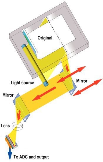
What we see when we do a scan is the light source moving across the document. The reflected light from each scan position is collected using mirrors, and focused (using a lens) on to the CCD array. The impression we have is of a continuous scan, but in fact the scan head is moved in a long series of very small steps using a so-called stepper motor.
Scanner manufacturers also talk of colour depth (or bit-depth), the number of bits used to indicate the colour of a single dot or pixel, which is an expression of how finely levels of colour can be expressed, and how broad a range of colours can be processed (the gamut of colours). The bit depth for each primary colour is termed the ‘bits per channel’, and each colour channel can have any range of intensity as specified by the bit depth. The ‘bits per pixel’ (bpp) is the addition of the bits in the three colour channels. Each pixel requires 24-bits to create standard ‘true colour’ for the three RGB colours (red, green and blue with 8-bits for each colour), although some scanners go beyond this and offer bit depths of 30- or 36-bits (so-called 'deep colour' such as with the sRGB colour space). We often see references to computer screens with ‘millions’ of colours for ‘true colour’ (256 levels for each primary colour, and thus 16.7 million colours), and ‘millions’ of colours for ‘deep colour'.
![]()
Just as a reminder, VGA was a 8-bits per pixel standard offering 256 colours, XVGA (‘high colour’) was a 16-bit per pixel standard offering 65,000 colours, and the 24-bits per pixel standard is also often called SVGA (‘true colour’). ‘Deep colour’ uses 10-bits for each of the 3 primary colours, allowing 1,024 shades for each colour and over a billion possible colours. What we see above is in fact the same image first using only 8-bits/pixel and then 24-bits/pixel.
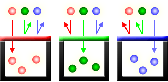
One way to obtain the 3 primary colours with the CCD array is to cover the array with a colour filter mosaic. This is a mosaic of tiny colour filters placed over the pixel sensors, so that each sensor sees only one colour - red, green or blue (otherwise the silicon-based diodes are sensitive to a wide spectrum of colours but register them as a single monochrome signal). We can think of these individual diodes as grey-scale luminance sensors with colour filters over them. One of these filter arrays is called a Bayer filter (as in the above illustration) which actually includes 2 green elements, along with a red and a blue element, thus mimicking the physiology of the human eye. They filter the light going to different sensors, so that one pixel registers the intensity of red, another blue and 2 pixels for green (so in reality everything is centred on 2 x 2 pixel squares). We can think of this colour filter mosaic as being 'printed' over the top of the CCD array.
The raw data captured by the image sensor is then converted to a full-colour image by a demosaicing algorithm which is tailored for each type of colour filter.
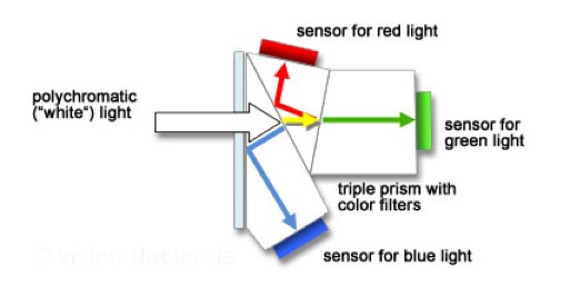
I have not been able to find the exact description of the actual CCD array and scanning hardware used in the HP Scanjet G4010. The most common technique (at least at the time of manufacture of the G4010) was to have each pixel composed of four photodiodes with the RGB colour filters. Some CCD architectures include an array of CCD photodiodes coupled with a second storage array. These storage arrays immediately collect and convert the electrical signal from the image array, thus achieving faster frame rates (faster scanning). We have already noted that a CCD array is monochrome in nature and the filter ensures that the array captures one of the RGB colours. Another technique is to use a dichroic beam splitter prism to split the image into red, green and blue components and to send each component to a different CCD array.
We tend to ignore the fact that a scanner using a CCD array is no different from a digital camera. They have the same features. Light is focussed onto a CCD array using a lens. The image is processed through a AC/DC converter and a digital signal processor. The signal is demosaiced, white-balanced, colour corrected, sharpened, and compressed for storage using a standard file format.
I have not found a description of the CCD array used in the HP Scanjet G4010, nor how they define the scanner as 6 colours, 96-bits.
Resolution
A digital camera reduces a scene and its continuous detail and colours into a set of discrete values. So resolution is defined in steps called ‘pixels’ and brightness in steps called ‘levels’. The breakup of an image into pixels is called ‘pixelation' and the brightness is broken into 'posterisation'. The smaller the intervals of resolution (pixelation) and brightness (posterisation) that an image is digitised into, the more its appearance will maintain the illusion of continuousness. So the question is always going to be about the number of pixels and levels that are needed to capture a specific image.
In the case of a scanner the number of sensors in the CCD array determines its resolution, and thus sharpness (along with the precision of the stepper motor that moves the CCD array). A 300 x 300 dots/inch (dpi) scanner (typical for a A4 page scan) would have 2,550 sensors for each colour arranged in a row, thus for a total of 7,650 sensors. The stepper motor would move in increments of 1/300th of an inch. Resolution also depends upon the quality of the light source and lens used. For a scanner claiming a hardware resolution of 9600 x 9600 dpi the CCD array would contain 81,600 sensors (using the three colours), and the stepping motor would move in increments of 1/9600th of an inch.
Some scanners offer software resolutions in excess of the hardware resolution. They do this by interpolating between the pixels in the hardware resolution and creating additional pixels to increase the perceived resolution of an image. For example a simple scanner might offer a hardware resolution of 300 x 300 dpi, and a software resolution of 600 x 300 dpi.
One of the (many) irritating aspects in properly preparing for a digitisation program (scanning) is that Apples' Image Capture talks in pixels/inch, HP Scan talks in pixels/cm, and many scanning guides, etc. talk in dots/inch. Using pixels is related to the resolution (pixel density) of a screen or image scanner or camera (and can be considered as an input resolution). Dots are often mentioned in the context of the physical printing resolution (an output resolution), but often people considered dots interchangeable with pixels (which is technically not true).
The Software
Naturally in his book Ctein reviewed a number of software packages, including Photoshop. But not the package I have, called Pixelmator.
Ctein stressed that it was important that the package accepts TIFF files and was able to use masks (a grayscale image that has the same dimensions as the image), and had adjustment layers and curves. He also recommended a 16-bit workflow.
Using the Scanner
The first step is to obtain the original photograph (or better still the negative). Ctein noted that we should not try to remove any tape over the photograph. We should scan it, tape and all. He was very negative about adhesive photograph albums where the “gum” tends to harden with age.
Thirty-five (35) mm slides should be removed from their mounts. Ctein also recommends spending time cleaning the photograph or slide before scanning. For good condition originals he uses solvent-based pads, an anti-static brush, and compressed air. For deteriorated material he did not use anything wet. There is also the risk of scratching the surface in trying to remove dust and dirt. Never use cotton tabs because they are very abrasive. The best way is just a light brush with an anti-static brush and a burst of compressed air. Anything that does not want to move can be scanned with the photograph and removed later using the software.
With good quality photographs the ideal scan will capture the full range of tones, from near-black to near-white (without forcing them to pure black or pure white). Ctein looks at the scanner histogram before deciding on the final scan conditions. He looks for a good histogram that uses the full tonal range available, without any clipping of the near-whites or near-blacks.
It’s usually a bad idea to make a scan that faithfully reproduces a deteriorated photograph (e.g. a faded B&W photograph). Ctein adjusts the Curves and Levels for each colour channel in the scanner software to find a good range of tones for all three colours (also for b&w originals). One problem to avoid is trying to produce a full range of tones when the original does not have enough distinct grey levels to fill in the gaps in the histogram (i.e. producing a ‘picket fence’ histogram with missing tones). The key is to only use the tonal levels that are available, and not push it too far. Avoid a lot of tonal gaps, but a few gaps will still work out fine.
Quite a number of professionals talk about scanning at between 300 ppi and 600 ppi (depending upon the size of the original), switching off any ‘auto enhancing’ options in the scanner, and saving the scan as a jpeg file. To some degree this contradicts the advice of Ctein.
Ctein scans B&W photographs in 16-bit mode in order to get enough grey levels. So the best for B&W is to scan in 16-bit mode and adjust the histogram to get a full range of tones. He noted that most scanner don’t produce 16-bit files, but they may scan in 10- or 12-bits. Even 10-bit will have more than a 1000 grey levels, as compared to the usual 256 grey levels with an 8-bit scan. Usually a 10-bit is enough to correct the most seriously faded photographs. Ctein will pull the white and black sliders in Levels adjustment to more closely bracket the range of tones available (darkest pixels at 10-20, and the lightest pixels at around 240). You will have guessed that he always scans b&w prints in full colour. He later converts to monochrome using the software to desaturate and neutralise any colour casts. The point he makes is that colour in a b&w image helps distinguish different damaged areas that may need restoration. Finally he does not use the automatic grayscale conversion, but mixes the channels with the monochrome option selected (picking only the best channels to get the best results and producing an RGB that looks monochrome).
Ctein always used 16-bit mode also for colour, and he goes through the same histogram manipulation as with b&w photographs (remember he treats b&w photographs as colour scans). The key is to expand the histogram to the point where it is still well populated and will produce a good continuous tone quality. But remember a 8” x 10” print scanned at 600 ppi in 16-bit mode will produce a 175 MB file. He recommends doing the scan in 16-bits to get the fullest tonal range (histograms, etc.), and if needed convert then to 8-bit for any final software retouches. Remembering that most printer drives don’t go beyond 8-bits, and JPEG is an 8-bit standard (24-bits for the 3 colours).
So Ctein recommends adjusting the Levels or Curves in the scanner software the same way you would if you were scanning b&w prints. The resulting scan might have an overall colour cast which can be corrected by shifting the mid-tone sliders in each channel’s levels adjustment until the average colour looks good. He will often make 3 or 4 different scans before deciding on the best one.
Ctein mentioned that software restoration modules are quite insensitive to the quality of the scan, so there is no need to spend too much time optimising the scan conditions. If you do too much work with the scanner, the automated restoration may turn out worse.
Ctein also recommends using 16-bit mode for negatives, because usually they have poor contrast. You could do worse that to scan a negative as if it were a slide, and then invert with the software. Automated scan software for negatives will try to find the best print-quality option, and will not capture the full density range of the negative. Scanning the colour slide in 16-bit mode ensures that you have plenty of well-discriminated tonal information in the highlights and shadows so that you won’t see posterisation and banding when you improve the overall contrast characteristics of the photograph.
Ctein noted that faded slides can be particularly tricky to scan. Often one dye layer is hardly faded at all, while at the same time there is an overall buildup of stains. The result is that even though the slide looks pale and washed out to the eye (and sometimes to the scanner’s exposure control), it may actually have higher-than-normal density in one or more channels. Despite the best efforts of the scanner, the darker areas in that channel may go solid ‘black' in the scan, eliminating any possibility of good colour correction in those portions of the photograph. Scanning in 16-bit mode may bring in that extra-high-density data. However, you’ll often encounter cases in which even that won’t be enough. When that happens, the first thing to try is scanning the film into a larger colour space. Enough said for the moment, but if we have this problem we will need to delve deeper.
What resolution is best?
Picking the right scanning resolution is important and is going to be dependent upon the size and quality of the original. It will also depend upon the use intended for the image. Small photographs are often viewed on screens, and are magnified to fill the screen (a small photograph will be automatically magnified 4x just to fill a notebook screen). If they have been scanned at only 300 dpi, then they will look out of focus (and artefacts may also appear on the edges of objects in the image). Matte photographs when scanned integrate the matte finish into the captured image, and this can also can affect how we will later see a scanned image. Glossy photographs scan better.
In looking at what is the ‘best’ resolution I came across quite a number of recommendations. One very credible suggestion was to scan photographs at 3000 pixels along the longest side (as ‘good’ practice), or to scan photographs at 4000 pixels along the longest side (as best practice).
It is often stated that 300 dpi is the standard print quality for magazines (3000 pixels on the long side of a 10” photograph). However a poster could be printed at 240 dpi or even 200 dpi, depending upon the viewing distance. For example a 36” poster printed with 240 dpi needs a total of 8640 pixels along that side. Cmd+I will open the General Information window for a photograph and tell you the size of the image in pixels, e.g. 3264 x 2448. If printed at 300 dpi, this example would produce a good quality 10” (25 cm) photograph.
Best practice should be reserved for important, high-quality images contain considerable detail.
What is good practice for photographs?
For 2” on the longest side, scan at 1500 ppi
For 3” on the longest side, scan at 1000 ppi
For 4” on the longest side, scan at 750 ppi
For 5” on the longest side, scan at 600 ppi
For 6” on the longest side, scan at 500 ppi
For 7” on the longest side, scan at 430 ppi
For 8” on the longest side, scan at 375 ppi
For 10” on the longest side, scan at 300 ppi
What is best practice for photographs?
For 2” on the longest side, scan at 2000 ppi
For 3” on the longest side, scan at 1335 ppi
For 4” on the longest side, scan at 1000 ppi
For 5” on the longest side, scan at 800 ppi
For 6” on the longest side, scan at 670 ppi
For 7” on the longest side, scan at 575 ppi
For 8” on the longest side, scan at 500 ppi
For 10” on the longest side, scan at 400 ppi
Concerning 35 mm negatives and slides, good practice is to scan 35 mm negatives at 2300 ppi, and slides at 2150 ppi. Best practice is to scan 35 mm negatives at 3000 ppi, and slides at 2860 ppi.
Concerning medium format negatives, good practice is 1370 ppi for 2.2 inches on the long side, through to 1000 ppi for negatives with 4.2 inches on the long side. Best practice is 1820 ppi for 2.2 inches through to 1200 ppi for 4.2 inches.
For larger negatives, stick with the guide of 3000 pixels on the longest side for good practice, and 6000 pixels on the long side for best practice.
For very large photographs (in excess of 14” on the longest side), use 3000 pixels on the long side for good practice, and 8000 pixels on the long side for best practice.
Be ready for large TIFF files when using best practice, they can range from 21 MB to 256 MB. Even good practice can produce TIFF files in excess of 50 MB.
The above figures mostly derive from major national digitisation programs of historically important material.
The US Library of Congress (LoC) recommends scanning small photographs (up to 8” x 10”) at 300 dpi, but accepted that much depended upon the actual photograph. Others suggested 600 dpi, but experts in the LoC noted that for gelatin silver prints or chromogenic dye prints there was a risk that you end up scanning defects. Scanning a 4” x 6” photograph at 600 dpi will allow the creation of a new 8” x 12” print, but it will probably not deliver a better quality image. For a very high-quality 8” x 10” photograph it could be a good idea to scan at 600 dpi or even 1200 dpi, but again it should not be by default but only because the higher resolution is needed and justified by the condition of the original. Experts were of the opinion that it was best to keep to the optical resolution offered, and not to count on so-called interpolated sampling (such as nearest-neighbour interpolation).
They also recommended scanning b&w or colour negatives, or colour slides, at higher resolutions. For example scanning a slide at 1200 dpi would allow a final 4” x 6” print with 300 dpi. The LoC stated that it scanned 35 mm negatives at 3600 pixels along the longer side, so roughly 3000 dpi.
One LoC expert made the point that the resolutions quoted by scanner manufacturers were in fact sampling rates, and all scanners were nowhere near 100% efficient. Cameras are 80% to 95% efficient, but flat-bed scanners are at best 50% efficient. A 300 dpi could easily be less than 200 dpi in reality. In fact in the fine print many scanner manufacturers actually state “true 2400 ISO sampling rate” and not resolution (but they stick 2400 dpi on the box). In addition the resolving capability of the human eye is usually quoted at something between 320 ppi and 450 ppi (pixels/inch), so (it is claimed) a 300 dpi print or screen view is more than sufficient for everyday use. One comment on this option was that it was a false logic, since much depends upon viewing distance. For example we can see the fine threads in a spiders web, which suggest a resolving ability of the human eye in excess of 6000 pixels/inch when close up to something.
Being pragmatic about resolution
Many photographers, even professionals, tended to be more pragmatic than collection owners and archives. Ctein points out that it’s rare to find an old photograph that has 1200 ppi worth of fine detail. For 8” x 10” and larger originals there usually won’t be even 600 ppi worth of detail in the photograph. Often a 300 ppi scan can capture all the real detail in a photograph. His suggestion is if in doubt scan at different resolutions, and look at the fine detail to determine the optimum resolution to be used.
Quite a number of experts support the idea that scanning photographs at 1200 dpi is “beyond excellent”, and even for a 6” x 4” photograph it will produce an uncompressed TIFF file of more than 35 megapixels. And HP expert said that even 200 dpi is enough for a normal silver halide colour print, so sticking with 300 dpi is fine.
In fact there are many, many sources of advice on the Web. Most tend to support the idea that 300 dpi is enough for people who want to reprint a photograph of the same size, or who want to view it on an HDTV screen. For people wanting to enlarge photographs the advice is that they should scan at 600 dpi, or even 1200 dpi, and this is particularly true when scanning small formats that people will inevitably want to enlarge. Old letters and documents should be scanned at 300 dpi (I do this regularly with my documents). And finally if you want to keep the photographs for ‘posterity’ the most frequent advice is to scan at 600 dpi or 1200 dpi.
Some people looked more carefully at what was being scanned and what was likely to be printed. Continuous-tone images (i.e. photographs) can have subtile colour and tonal graduations, and the trick is to capture as much tonal information as possible. Oversampling the photograph can be useful since the software can average the values to arrive a more-precise value for individual pixels. Oversampling by 1.5 or 2 times can ensure that the tonal and colour values are more accurately translated into a halftone pattern. But oversampling at more than 2 times does not improve the halftone process and is a waste of time. One expert made the following simple calculation. If you plan to scan a 35 mm colour slide which will be enlarged to 200% for a brochure which will be printed at 175 lpi (lines/Inch) then you need to scan at 525 ppi to 700 ppi (175 lpi x 1.5 or 2 x 200%).
A different perspective is that whilst good quality printers claim a resolution of 1200 dpi or even 2400 dpi, they are actually referring to micro-dots that are merged to create differing shades of grey or colour. And in fact the printer drivers are often only able to produce finished resolutions of 240 dpi or 300 dpi. So yes to 1200 dpi scanning, but do not expect the final printed image to look better than the original (unless some “enhancements” have been applied).
One expert noted that a professional photo-lab will usually accept images at either 200 ppi (colour photographs) or 400 ppi (black text on white background). Others mention photo-labs working at 400 ppi, 360 ppi, 250 ppi, and 200 ppi.
Some professionals tended to adopt even simpler rules, i.e. scan at 300 ppi for photographs that were going to be reproduced at the same size. If clients wanted to double the size of the print, they doubled the scanning resolution.
Line-art drawings and technical illustrations can be scanned in black and white. One professional said that they should be scanned at the same resolution as they will be re-printed, but they normally should be scanned at 300 ppi or better. Another professional said that he scanned line-art at 1200 ppi to reduce pixelation.
High-resolution scans of low-resolution prints can be useful when there’s physical damage with sharply defined, clear edges. Scanning at higher resolutions spreads out real image detail over many more pixels while the edges of damaged areas remain pixel-sharp. This makes it easier to use edge-finding filters and similar tools to extract the boundaries of the damaged areas.
When scanning film (slides and negatives), be aware that scanning usually increases grain no matter what type of film was used. That’s because a ‘grain’ in a digital file can be no smaller than a single pixel. Even coarse-grained b&w film has film grains smaller than most scanners’ pixels. Consequently grain is magnified in scans. Good software tools exist for reducing the impact of grain, but it’s hard to make it go away entirely. The best way to minimise grain in a digital scan is to scan at the very highest true (not interpolated) resolution. That will make the grain finer and more like it was in the original negative.
Putting aside grain problems, the older the original the less likely you are to need a high-resolution scan of it. By and large, old photographs get their wonderful sharpness and rich tonal qualities from the large size of the films and plates of the time. However, although old-style emulsions were often very fine grained and sharp, the same cannot be said for the camera lenses. The techniques of the photographers of the time didn’t usually lend themselves to ultra-sharp photographs. On average, a photograph made by a casual 35 mm camera user in the late-20th C has much finer detail than a professional photograph made a century earlier.
Some professions say that you should scan b&w photographs in grayscale, others say scan in colour.
One important tip for scanning smaller negatives. Always scan film in a glass carrier! No glassless flat film carrier has been made that holds the film well enough to give you an edge-to-edge sharp scan.
Some people even suggested that it was better to scan at the highest resolution possible just in case there was a way found later to make blurry images crisp! It is true that we may, in the future, be using large high-resolution screens to view our old photographs. The argument goes that therefore we should scan old photographs at a very high resolution. I think it is obvious in the above discussion that scanning at a higher resolution does not mean that the resultant image will be better. The key is to scan at a resolution which makes sense based upon the information content of the original. Many old photographs are simply not of a high quality, and many scanners oversell/miss-sell their performance. However some people argued that when scanning photographs at higher resolutions and zooming in on details, they could see more useful detail than in a lower resolution scan. A fine example of this hunt for detail is in a Smithsonian article in which they are able to identify Abraham Lincoln in some photographs from the Gettysburg Address (Nov. 1863). But many experts have noted that scanning at a higher resolution also “flattens” some features, e.g. grass actually may look more real (see blades, etc.) at a lower resolution, but looks more uniform and bland at higher resolutions. There could be more information in the higher resolution scan, but that does not mean that the resultant image is better. All the more reason to focus on what is important in the original photograph, e.g. a face or a name plate may be important and the resolution should be selected in order to capture that detail as best as possible. One expert summed up this issue by saying that resolution should go beyond “harsh and jagged”, to “action and variability”, but not go on to “smoothness and consistency”.
On this point one of the experts noted that there is a way to settle the issue. Scan the same original at (say) 300 dpi and 600 dpi. Use specialist software to “subtract” the 300 dpi image from the 600 dpi image. Looking at the absolute values of the differences, what will remain is a very, very, low contrast image. After normalisation, if there remains some ghostly or shadowy detail then the higher resolution scan could be useful. If there are just speckles, then this is noise, and there is no value in scanning at a higher resolution. This technique can also be used to see if interpolation techniques are useful or not. His opinion was that for family snaps, etc. (even with high quality camera lenses) there was probably no additional information to be found by scanning at 600 dpi than 300 dpi. This was simply due to the fact that print quality was usually limited to about 300 dpi, principally due to the fact that printers can only resolve a luminance range of about 100:1. However, one very practical suggestion was to focus on a particular detail (possibly valuable in the context of the original photograph), and ensure that the scan resolution is enough to capture that detail, also under zoom.
So something as apparently easy as “resolution” is really fraught with uncertainty. Check out these three blogs post on the US Library of Congress Website, the first on what is resolution?, the second on what resolution should I look for when I buy a scanner?, and the third on what resolution should I use when using my scanner?. And here is the LoC Digital Scan Service specification. For photographs and prints they use 800 dpi for 4” x 5”, 600 dpi for 5” x 7”, 400 dpi for 8” x 10”, and 300 dpi for 11” x 14”. For nitrate negatives they specify 3200 dpi for 35 mm, 2400 dpi for 2 1/4”, and 1200 dpi for 4” x 5” negatives. For slides they specify 3200 dpi for 35 mm non-nitrate negatives down to 600 dpi for 8” x 10” non-nitrate negatives.
More on resolution
Resolution defines the content (or information) in an image, captured, printed, or on a screen. It is usually defined in units of pixels/inch, or pixels/cm, or dots/inch, and more pixels or dots can mean a higher resolution and more information (and certainly means longer scan times and bigger file sizes). Resolution is really all about scanning and observing clearly in an image the smallest object with distinct boundaries, as such it is the primary characteristic in “image quality”. Technically resolution is often defined as the ability to distinguish between closely spaced elements, for example between two lines. Acutance describes how quickly image information transitions at an edge, with sharper edges defining more clearly boarders between two elements.
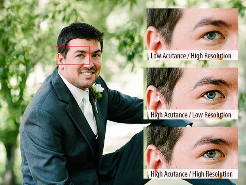
On the top we have an image with low acutance and high resolution, in the middle we have an image with high acutance and low resolution, and on the bottom we have an image with high acutance and high resolution
In terms of scanning we talk about capturing a specific photograph with a certain number of pixels/inch (or pixels/cm). So a specific image might be captured at 3000 pixels along one side and 2000 pixels along the other, this 3000 x 2000 pixels defines the resolution, and equals a 6 megapixel image. As a file on a computer, a pixel has no size. But when viewing or printing the image the pixels acquire a physical size as they are translated into dots, and the resolution seen is often expressed in dots/inch (dpi). Depending upon the size of the print or the screen a 6 megapixel image can appear very clear or very blurred. In very practical terms, a 6 megapixel image would produce a perfectly nice picture of about 10 inches (25 cm) in a print magazine, and at the same time could fill the entire screen of a laptop that has a resolution of around 100 pixels/inch (the Apple Retina display has a resolution of 220 pixels/inch). Given that many experts quote as fact that the human eye has a resolution capacity of just under 200 dpi, I presume this is why most photo labs print at 300 dpi (however I’ve seen statements that they print at 600 dpi, or even 1200 dpi). It is worth remembering that if you scan a photograph at 300 dpi, then that will make a print copy of the same size and quality as the original (this is about the same at HDTV quality). Scanning that photograph at (say) 600 dpi can produce a print photograph double in size (but will not double the quality of the image).
One mistake many people make is to take one of their scanned images, crop it, and then enlarge it on the screen. They are then surprised at the poor quality. The reality is that in cropping the image they have discarded a big chunk of the information in the image, cutting out 1,000’s of pixels. In expanding the cropped image they are magnifying fewer pixels, and therefore the image will start to look blurred. On top of that they may have saved (replaced) the cropped image file over the original. Always edit a copy of the original, and keep the original intact and safe. This process of cropping is how modern cameras offer a “software zoom”. The software zoom is just the cropping of the captured image, and expanded to fill the screen. People should not be surprised that the resultant image in not as good as the original.
There are some tricks that can be use to make poor resolution images look better. Spatial anti-aliasing can make jagged edges (associated with low resolution images) appear smoother as in higher resolution images. Another trick is to “smart sharpen” on the dark and light areas in an image, making edges look sharper.
What is the best image format?
If we push the button “save” what do we get? Before we decide anything else we have to pick the format. For example, the scanner program HP Scan offered JPEG, TIFF, PNG, JPEG2000, GIF, BMP, PDF.
Each format is optimised for a specific use, the question is to just pick the format that is right for us!
These formats are divided into raster (pixel) and vector (curve) formats. BMP, TIFF, GIF, RAW, PNG, JPEG and JPEG2000 are raster or pixel formats, and PDF is a vector format. Vector images are essentially mathematical equations and are resolution independent, but raster (pixel) images are resolution dependent. In some cases pixels must be “stretched” which can result in “pixelated” or blurry images. All file types can be compressed, and raster (pixel) images can be compressed lossless or lossy.
JPEG is good for images and photographs but is said to be lossy, i.e. data is compressed and some information is lost. But JPEG tries to retain detail and thus keeps a lot of brightness information as the cost of discarding some colour information (the human eye is more sensitive to light levels than colour). In this sense the compression is said not to detract noticeably from the image. The more detailed the image the less JPEG can compress it, but smooth skies and limited textures compress very well.
TIFF is a lossless raster format and is usually considered the best format for high quality work since it does not introduce compression artefacts.
GIF is a lossless raster format with a limited colour depth. It is really only useful for simple illustrations and Web animation and graphics.
PNG is a more recent lossless raster format (next-generation GIF) that manages to mix good features, and is increasingly used for images in Webpages. It has a built-in transparency channel.
BMP is used by Microsoft for graphics and is similar to uncompressed TIFF but it has larger files sizes and no added advantages.
PDF is a device-independent document format (so not really optimised for images).
JPEG2000 is much more than a simple upgrade of JPEG, but it still remains lossy even if the compressions is based upon a completely different type of “transformation”. JPEG2000 is thus superior to JPEG, and many people have also suggested that JPEG2000 is replacing TIFF as the preferred archive format for professionals.
In fact a number of professional teams working on scanning and long-term archival have adopted JPEG2000, e.g. check out the JPEG2000 Summit (2011), JP2K wiki and a recent Internet Archive blog (July 31, 2017) which talks about their use of JPEG2000. Reading through a number of other postings it looked as if the JPEG2000 robustness, file size, and interoperability made it the best format for access, but that it was still probably true to say that TIFF might still have the edge as a long-term preservation format.
In fact according to Wikipedia there were (and are) a multitude of different image file (or graphics) formats. There are a variety of suggestions concerning which format is “fit for use”. Some said 300 dpi to JPEG was enough for most needs, provided we did not want to crop and manipulate parts of the image. Others said that we should use TIFF with compression turned off, and avoid JPEG and compressed TIFF (which is still lossless). Many experts suggested that 300 dpi is not enough for quality colour reproduction and sharpness, even if the original print quality is not that good. Yet other experts suggested that scanning over 600 dpi is “pointless” and you should aim to “just” oversample the source image. Some experts noted that most photographs were printed at 300 dpi, and therefore sampling at 600 dpi was enough (allowing a print size of up to 30 cm by 20 cm from an original of 15 cm by 10 cm). A scan of 1800 dpi was only needed if the intent was to produce large posters. Uncompressed TIFF was mentioned as giving the best colour fidelity, and a few experts suggested always aiming for a scan of about 3700 x 5600 pixels (about a 20 megapixel image). Others admitted that JPEG provided good quality and small size, and was fine for snapshots and memories. Here is a comparison table of common image file formats.
I have mentioned just a few sources of useful information on JPEG2000, but it is perhaps useful to look in more detail at digitisation as a “professional” topic. The US has a Federal Agencies Digital Guidelines Initiative, and they publish Technical Guidelines for Digitising Cultural Heritage Materials (Sept. 2016). Whilst focussing on high-quality digitisation of valuable historical material for long-term access and archival, they nevertheless can provide useful pointers to what the man-in-the-street (me!) might need to consider.
So what do these guidelines say? What they say is that resolution (pixels/inch), tone (how light levels are captured), white balance (or colour neutrality), how highlights and shades (illuminance non-uniformity) are dealt with, colour accuracy, how image sharpening is used, and how noise, distortions and artefacts are treated, are all important. They differentiate between master file formats for both archival and production, i.e. a production master format would be made from the archival master. And they also introduce what they call access file formats, i.e. formats used for viewing, general access, and the creation of services, etc. The report stresses the use of lossless compression and of JPEG2000, and they point to a page on digital formats hosted by the US Library of Congress.
As an aside, until now we have not mentioned the RAW image format, the unprocessed image format produced by many digital cameras (often called the “digital negative”). Almost every company has its own version of RAW, e.g. CRW (Canon), NEF (Nikon), DNG (Adobe). Our focus here is on scanning existing photographs to create an archive (to which digitally native images can be added). So the RAW format is not a main focus for us, even if many professional photographers use this format, and then post-process to 16-bit TIFF or 8-bit JPEG later. RAW has many advantages, for example most cameras have 12- or 14-bit depth with up to 16,384 shades as compared to JPEG’s 256 shades, so RAW records colour with a much finer tonal graduation (i.e. more colour depth). So the camera is actually capturing a massive amount of information, then discarding much of it when recording the image in JPEG format. The down side with RAW is that file sizes are up to 6 times bigger than JPEG files. However people who take 1,000’s of pictures (e.g. wedding photographers) tend to use only JPEG just to save time in post-processing (they usually control well contrast and illumination and are looking for just a few images to tweak for printing). Sports photographers also tend to use JPEG because the smaller files are easier to send to their picture editors during sporting events, etc. (e.g. a photograph of a goal scorer can be processed and posted on their Website within a few minutes).
Can we summarise what these digital guidelines might mean to my digitisation program?
Concerning books, manuscripts, maps, posters, and newspapers, experts suggest scanning in colour at 400 pixels/inch, using TIFF or the JPEG200 formats, and the Adobe 1998, sRGB, or ECI-RGBv2 colour space. For paintings, high-quality photographs, etc. they recommend scanning in colour at 600 pixels/inch, using TIFF as the master file format, and the Adobe 1988 or ECI-RGBv2 colour space.
Concerning amateur photographs they did say that 200 pixels/inch was a minimum (for the TIFF master format) but that accurate tone and colour were just as important.
They actually disapproved of using digital dust removal techniques, or colour and tone enhancement, or colour restoration. I think the idea was that the master would be as faithful to the present-day physical object, and that different processing techniques should (could) be used only when making production and access copies.
Negatives and slides should be scanned in colour at 4000 pixels/inch, archived in the TIFF format, and using the Adobe 1988 or ECI-RGBv2 colour space.
Confused? Don’t be, check out this guide to digitisation guidelines and the practical work going on in Ireland, Australia, Germany, UK, ... What we find (see this report) is that many digitising organisations are pragmatic when selecting an archival format. Tradition has it that an uncompressed TIFF should be used, but many are now using lossless (or even lossy) JPEG2000 on the basis that the same file can be used for both archival and production, and that JPEG2000 is “fit-for-purpose” and more economic. This is particularly true for photographs that do not warrant (from the quality perspective) the scanning and archival of uncompressed TIFF, i.e. often a compressed JPEG2000 image is visually identical to the original. For example, this approach has been adopted by the US National Digital Newspaper Program, by the Wellcome Digital Library, by the British Newspaper Archive, and by the Google Books project.
Bit depth
The illusion of continuous tone (or colour), as opposed to visible steps or jumps of tone, is ensured by a so-called 8-bit channel which has 256 discrete levels to describe the entire tonal range from black to white. Colour is described by three 8-bit channels, for a total of 24-bits. This is called RGB (red, green, blue).
Digital cameras usually record the scene in more than 8 bits per channel. For example, Canon has a camera that works with 14-bits (or more than 16,000 levels) and then reduces the output to an optimum 8-bits per channel. The higher the camera’s bit depth the greater number of levels of tone the image is captured in. A higher bit depth results in smoother tonal transitions and less obvious posterisation. The aim of all manufacturers is not to start with 8-bits per channel, but to end with 8-bits per channel. For example many professionals prefer to work with a 16-bit workflow, despite the larger file sizes.
Bit depth is all about recording gamuts. Cameras and scanners can record larger colour gamuts than that captured on film, or seen on monitors, or printed. However recording a smaller colour space (gamut) can result in saturated colours becoming clipped and lost. For example, selecting sRGB for an in-camera colour space would be fine for viewing on a computer monitor, but would be a mistake when printing to a wide gamut inkjet printer. Compressing the gamut too early in the workflow will result in the loss of important colour information.
Histograms are used by both professional and amateur photographers to inspect and manipulate the tones in an image. The histogram maps pixels of resolution against levels of brightness, and they are used to evaluate, modify and repair the capture image.
So each pixel in an image has a colour produced by some combination of the primary colours red, green and blue (RGB), and each of these colours can have a brightness value of 0-255 when working with a bit depth of 8-bits. We can construct a histogram for each colour as captured, i.e. how many pixels have a specific colour brightness value of 0 through to the number having a brightness value of 255 (0 being very black and 255 being a bright pure colour).
We can also construct a histogram of the RGB brightness values, i.e. how many pixels have a brightness value of 0 through to the number having a brightness value of 255 (in this case 0 is still very black but 255 is now bright pure white). This is just the addition of the three separate colour histograms.
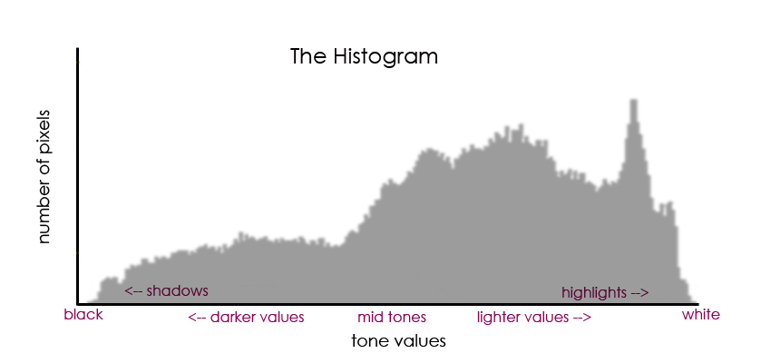
Brightness is often called lightness or tone, and the histogram is often termed an image histogram (with tonal variation along the x-axis and number of pixels with that tonal value on the y-axis). Editing the histogram allows the user to adjust the brightness, and thus the contrast between shadows and highlights in the image.
Our perception of luminance (brightness) is non-linear and this allows us to use gamma compression to reduce the file size of a stored image whilst not affective too much our perception of image quality.
What do we mean by editing?
Below we have an example (the famous Lenna image) of a cumulative histogram, and what we seen is that the image is dominated by gray areas with few very dark and bright pixels. Equalising (editing) the cumulative histogram makes some pixels darker and others lighter and enhances contrast.
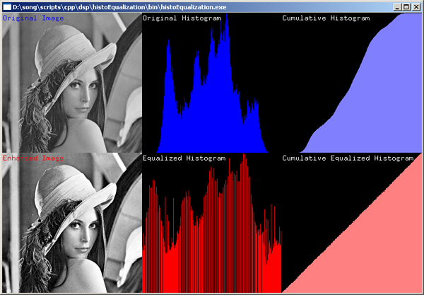
Image capture systems (e.g. cameras) working automatically will usually try to adjust to the central grey areas, and they will try to avoid overexposure with solid white areas, even if it means underexposing darker areas. Overexposure means too many areas become pure white, and contrast and texture in those areas are lost (forever). This is called ‘clipping’ or ‘browning’. If the histogram is spread over a small section of the x-axis then that will mean that there are (too) many pixels all having more or less the same brightness. This corresponds to an image with poor contrast (lack of texture with few deep shadows and bright highlights, etc.). Professional photographers can split an image into different parts, produce histograms for each part, and alter the contrast in each part to create a unified whole.
The ‘brightness’ or RGB histogram described above is not the only type of histogram that can be created from the raw pixel data. Luminance refers to the absolute amount of light emitted by an object per unit area, whereas luminosity refers to the perceived brightness of that object as seen by a human observer (i.e. weighted by a factor representing how sensitive the eye is at different wavelengths). There exists luminance histograms, which unfortunately are incorrectly named since they are in fact histograms of perceived luminosity. We know that the human eye is more sensitive to green light than to red or blue light. In fact looking at just the histogram of the brightness of green light we would see that it is closest in shape to the final RGB histogram. Luminance histograms are built from the weighted average of the three colours for each pixel, with green representing 59%, red 30% and blue on 11%.
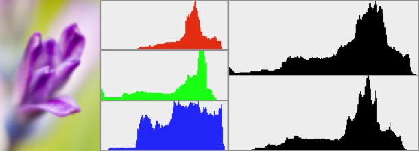
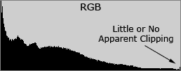
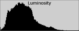
Above we can see the individual histograms for the red, green and blue channels, and the RGB composite histogram representing the tonal range of the image (upper black histogram). Below the RGB composite histogram is the luminosity histogram (lower black histogram). Firstly, the RGB histogram is quite narrow suggesting a low contrast image. Secondly, there is a suggestion of colour clipping particularly in the blue channel, i.e. a loss of contrast in the blue. Thirdly, the clipping appears to also affect the RGB histogram, meaning that there is loss of information (in this case) in the highlights.
Luminance histograms describe better the perceived brightness in an image. One major difference between RGB histograms and luminance histograms is that for RGB histograms a single pixel might appear in three different places, the red in one channel, the green in a different channel, and the blue in yet a different channel. So the three different colour histograms are created and then they are just added together. However in the luminance histogram the three different colours in a single pixel are weighted and added together for a single brightness value for that pixel, thus the luminance histogram is composed of pixel-by-pixel information.
If we look at the above graphs we can see that there was some clipping in the blue that translated into the RGB histogram, wheres on the luminance histogram we see no clipping, because the addition of red, green and blue in the same pixel did not produce an excessive brightness.
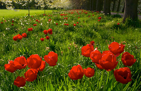
Lets look at a simple example. Below we have a photograph, and the same photograph of just the red channel.
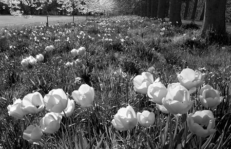
Below we can see the RGB histogram and the luminance histogram, neither showing any clipping.
Yet if we look at just the red channel, we can see some visible clipping probably due to the flowers being exposed to direct sunlight (and thus some lost of detail in the red flower petals).
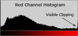
So the red flowers have lost texture in the red, but have retained some luminance and texture in the other two colours.
There is much more to editing than has been mentioned above, but at least I’ve made a start.
Bit depth is also about colour management
The reality is that we can’t look at an image, scan it, look at it on a screen, re-print it, and expect that they all will automatically look identical. Every device (camera, scanner, screen and printer), will display the colours differently. In fact there are substantial differences between different manufacturers of cameras, scanners, screen and printers, and none can reproduce all the colours that can be perceived by a human being. In any consumer electronics showroom you can see the differences between televisions for the same source signal.
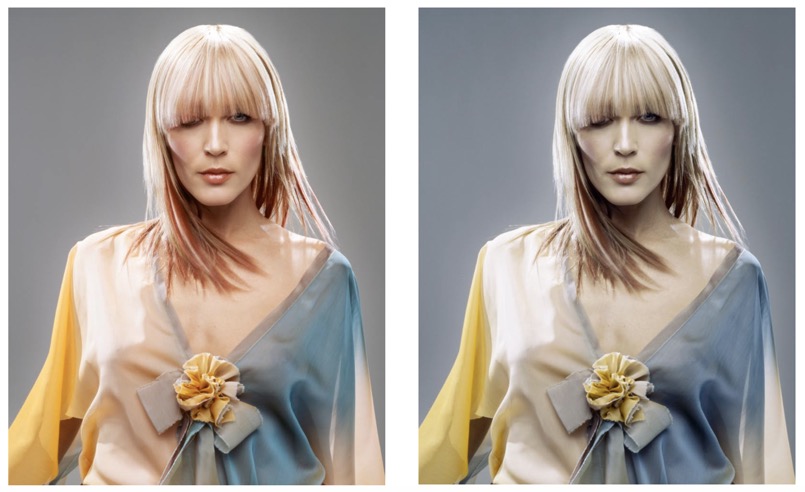
The picture on the left is what might be seen on a screen, whereas on the right we have a print of the same image if it were sent to the printer without using a profile.
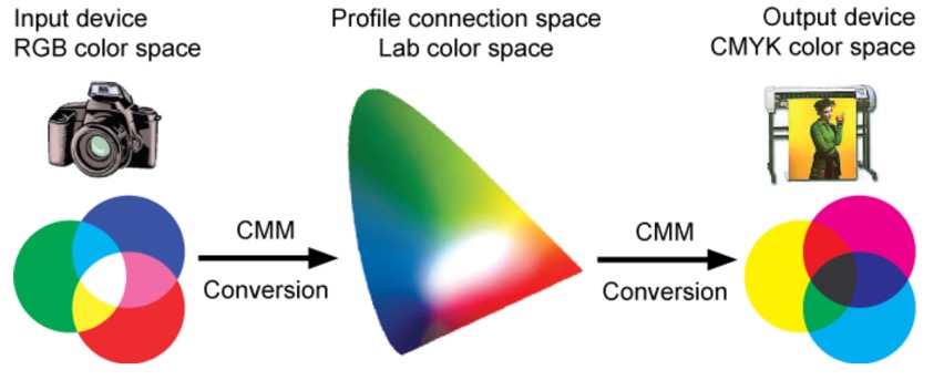
So every device has a defined image profile, so that it can communicate with the image profile of another device. For example scanners use RGB values (primary colours: red, green and blue) and printers use CMYK values (secondary colours: cyan, magenta, yellow, and K for black ink). The CIE (International Commission on Illumination) has defined two device-independent 3-dimensional profile connection spaces called CIE XYZ and CIE LAB (or L*a*b*), which are used in profile generation. They describe all the colours visible to the human eye. The Yxy (or xyY) system, also device-independent, specifies a colour by its x and y coordinates on a graph called the chromaticity diagram, and it is often used to analyse and compare colour gamuts of different devices.
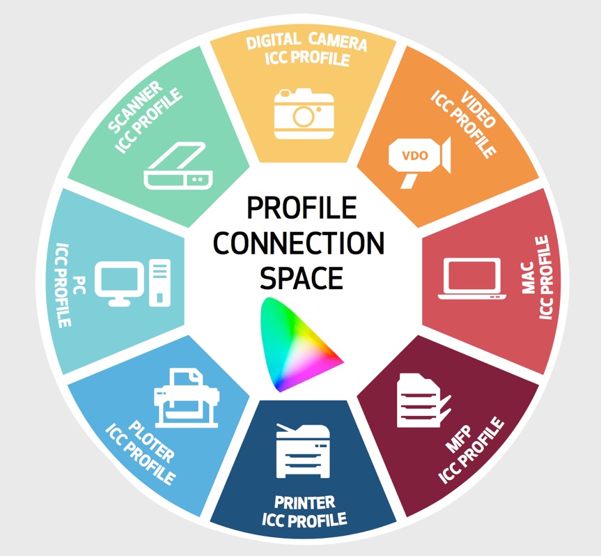
Device profiles are used to move from the RGB values that a scanner produces to a LAB number for each colour, which can then be properly understood by the profile of a specific printer. Profile formats are defined by the International Colour Consortium (ICC). The profile describes the attributes of the device, defining a mapping between source and target colour spaces via a profile connection space (PCS), which is usually based upon either the CIE XYZ or CIE LAB (CIE L*a*b*) colour space. The profile connection space is an interim space were unambiguous numerical values are used to describe colour values using a colour model that matches the way humans see colour. The implication with device profiles is that images from a camera or scanner will include colours that a screen or printer cannot reproduce. It is the task of the screen or printer profile to find ways to replace those colours in terms of either perception, relative and absolute colourimetry, or saturation. One way to make the substitution is to please the eye, so changes are made to retain the relationships between colours. This ‘perceptual’ rendering shifts the colours ‘inward’ so that they are in gamut, but can create a sense of 'colour shift'. Another way is to preserve certain colours, and certain relationships between colours (as you might expect in a fine-art book), but it can include greys for the colours that are out of gamut. Another way is to exploit the full gamut of the screen or printer irrespective of the original colours (particularly useful in graphics with bright, vivid colours). So colours that are out of gamut are shifted, and colours in gamut become increasingly saturated. This can produce an image with colours that look different when changing from one device to another device, i.e. the colours you see on the screen might not be those that are printed.
Another way to look at a device profile is to remember that RGB values (one for each colour) are directly related to the number of electrons sent to a red phosphor (or LED) in a screen or the number of photons passing through a red filter in a camera or scanner. And every manufacturer uses a slightly different phosphor (or LED) and a slightly different filter material. Device profiles are designed to render RGB values unambiguous, a specific set of values for RGB should be perceived by humans as always the same specific colour. Colour management associates a profile with each image, and ensures that the information in the profile is retained as the image travels from capture, through manipulation to display.
It is important to ensuring that a profile is applied consistently. Calibration involves establishing a known starting condition, a comparison to a standard colour space. Once calibrated, a device can be characterised by creating its profile. Once a device has been calibrated and characterised it can then be included in software that converts images from one colour space to another.
In many ways colour management is about the workflow that moves an image from input (capture) to output (print) e.g. from RGB to LAB, and then from LAB to CMYK, including the possible to preview the image using a screen profile. Within this workflow there is space for editing, ‘tweaking' and restoring the image.
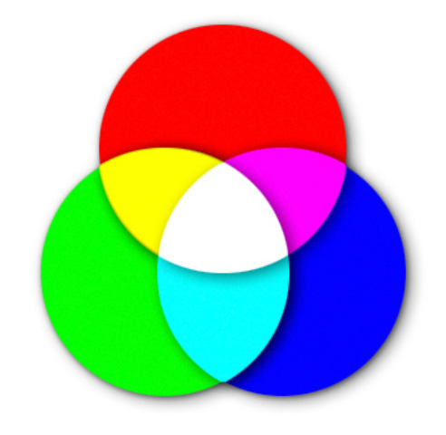
What do we mean when we talk about primary colours?
We often talk of 'basic' colours, which are colours such as red, but not red-orange or blood-red which are tints or shades of red. Tint is a colour mixed with white, and a shade is a colour mixed with black, and tone is the adding of grey otherwise understood as a mix of white and black. According to colour theory there are two ways to look at the mixing of colours. Additive colour is the mix of the primary colours red, green and blue to make white. Mixing two of these three primary colours together make the secondary colours cyan, magenta, and yellow. We can also mix colours in another way, subtractive colours is the mixing of the three secondary colours to make black. Subtractive means that if we start with white light and introduce filters that removed specific colours (cyan, magenta, and yellow) we will be left with black. For example, cyan is called the complement of red, meaning that it is a filter that absorbs red. In very simple terms the more cyan we put on a white sheet of paper controls the amount of red in white light that will be reflected back to the viewer (but cyan does not affect the reflected green or blue light).
The key here is the word ‘reflection’, with subtractive colours being created by the reflection of light from a surface (typical for the mixing of pigments, dyes, and inks). Additive colours are created by emission, a light of specific frequency (or frequencies) emitted by a chemical elements in compounds (as in computer displays).
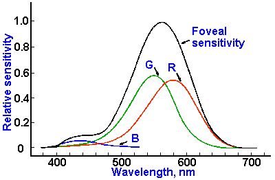
In fact there is a major different between a pure spectral yellow light (wavelength 580 nm) and a mixture of red and green light, but to the eye they both appear as yellow (due to way the three different types of cone cells in the retina of the mammalian eye function, a feature called trichromacy). It is important to note that the absorption or emission of light by physical surfaces and substances follows different rules from the perception of light by the human eye. We must also remember that the human eye is only sensitive to wavelengths from 380 nm to 770 nm, and that its sensitivity varies considerably with wavelength and with light levels. Below we can see the sensitivity of the three types of photoreceptor cells (cones) in the human retina (the foveal sensitivity is the part of the human eye that offers 100% visual acuity).
Strictly speaking physics recognises three different spectra or ‘visual fingerprints’. The spectrum of light emitted from a light source, the spectrum of light that is absorbed by a material (by looking at what is not absorbed), and the spectrum of light that is transmitted through a material. These spectra are complete and unambiguous descriptions of colour information. However the human eye interprets these spectra in different ways. Radiometry is about measuring all types of electromagnetic radiation, including light. Photometry is the science of measuring light in terms of perceived brightness to the human eye. Colourimetry is the study of the way humans perceive colour.
In addition to the idea of basic colour we also tend to use relative attributes to describe colours, i.e. lightness or tone (light vs. dark), saturation or colourfulness (intense vs. dull), hue (as in light-red) and brightness or luminance.
All languages include names for black, white, red, green, blue and yellow (as 6 basic colours), and all but a very few languages have words for pink, orange, purple, brown, grey and azure. More complex colours are often associated with the physical world, e.g. orange, olive, sea-green, etc. Pantone has managed to give an 'inspirational’ name to more than 3,000 different colours, even though the human eye can probably tell the difference between 2-10 million different colours and computer screens offer more than 16 million colours. But we should not forget that whilst smell, touch, and taste are physical sensations, colour is not a physical characteristic of an object, it is how we perceive something after light has interacted with our eyes and brains, and is thus strongly dependent upon the physical conditions (e.g. illumination), and our experiences and memories, etc.
The problem is now what to do with what are quite subjective (even idiosyncratic) concepts of colour, e.g. orange can be light, dark, intense, bright, blackish-orange, pale-orange, saffron, reddish-orange, yellowish-orange, Cadmium orange, pumpkin orange, Atomic tangerine, Vermillion, Persian orange, burnt orange, orange-brown, etc. One question was how to develop some logical scheme for ordering and specifying colours based upon some basic attributes? Another question was how to put all these colours (including luminance and hue) on to a single sheet of paper and keep similar colours close to each other? The answer to the first question was a colour notation system (or colour model), and the answer to the second question was the so-called 'colour space'.
More on colour models
RGB (red, green, blue) is an ‘additive’ colour model, describing what kinds of light (wavelengths) must be emitted to produce a given colour. This is a model used in devices that emit light, screens, projectors, etc. RGB is device dependent, whereas sRGB was created by HP and Microsoft to be used for all types of screens and printers, e.g. device-independent. Today many monitors and printers have a larger gamut than sRGB, but all offer sRGB as standard. If you have or see an image about which you have no information, you can start by assuming it is based on the sRGB colour model.
CMYK (cyan, magenta, yellow, black) is a colour model that depends upon the absorption of different kinds of light (wavelengths) on paper. Some light is absorbed, and the rest is reflected to the eye. In theory CMY is enough to make black, but in practice the inks contain impurities that result in a dirty brown, not black. So a black (K) ink is added to create four-colour printing.
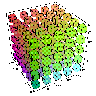
We have mentioned the LAB colour model. This is an international standard device-independent colour model. There were/are several LAB (or Lab) colour spaces. The one we often see mentioned is L*a*b* which uses luminosity or brightness component (L for lightness), a a-component ranging from green to magenta, and a b-component ranging from blue to yellow.
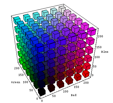
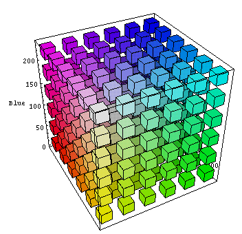
The simplest colour model, the RGB colour model, is a tuples of three numbers describing the amount of red, green and blue that makes up a particular colour as seen by the human eye (for a so-called “standard observer” observing a display made up of pixels emitting red, green and blue). For example, black is 0,0,0 and red is 255,0,0, but pink is 255,192,203, whereas hot pink is 255,105,180 and crimson is 220,20,60. These sets of three numbers can be visualised as x, y, and z axes in a three-dimensional space where the short-wavelengths (blue - 475 nm) are along the x-axis, the medium wavelengths (green - 510 nm) along the y-axis, and the long wavelengths (red - 650 nm) along the z-axis.
Below we have (first) the RGB colour space seen from black (0,0,0) and (second) the RGB colour space seen from white (255,255,255).
Other colour cubes are possible. Below we have the so-called Lab colour cube (lightness, a for green-magenta and b for blue-yellow).
There was also HSI (Hue, Saturation, Intensity) as a mapping of RGB into cylindrical coordinates, and was developed for the early introduction of colour television. As such it was basically a way to add colour to the existing black and white signals.
The Lab colour space exceeds the gamuts of the RGB colour model and is also device independent. Technically it is based upon a three-dimensional real number space, and can represent an infinite number of possible colours. However in practice it is used to represent L, a and b absolute values in a pre-defined range. There is an international reference colour space called CIELAB 1931, with L (lightness), a for green-magenta, and b for blue-yellow, and which links physical pure colours (wavelengths) to those perceived colours in the human colour vision. Still today CIE 1931 is the reference for display colour performance, even if CIE 1976 is recommended by the international standards committees.
More on colour spaces
We have seen that a colour model is a way to represent colours by numbers, typically three or four numbers. Mapping the colour model to a particular device creates a colour space with a certain gamut. So RGB is the colour model, and Adobe RGB and sRGB are different colour spaces (as is LAB mentioned above). Below we see an RGB colour space converted to the Lab colour space (so-called profile connection space) using a colour management module, and then using a different colour management module, mapped across to a CMYK colour space. As we might expect the Lab colour space completely covers both gamuts of both the RGB and CMYK colour spaces.
sRGB (or to give it its full title sRGB IEC-61966-2.1) is a multipurpose colour space for consumer digital devices, i.e. digital cameras to inkjet printers and computer screens. If a device does not indicate the profile used, it is almost certainly using sRGB as a default. It is good for things like the Web, but it severely clips the CMYK gamut so is unsuitable for photography and serious print work. Adobe RGB, some time also called Adobe RGB (1998), is a well established RGB editing space for conversion to CMYK for printing.
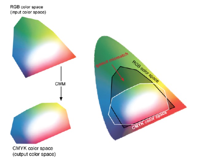
The above diagram clearly shows that a printer using the CMYK colour space cannot print a wide variety of colours, in particular the saturated colours and most of the green-turquoise area. We mentioned earlier that device profiles can take different approaches in dealing with colours that are outside its colour space. One way is to look to please the eye of the viewer by compressing the complete colour space but keeping the relative distances between two colours in the colour space intact. In this case the colours are not reproduced but the general image and colour gradients are preserved. This often used for screen viewing and photographs. Another way is not to compress the Lab colour space into the printer profile, but to reproduce exactly the colours that are available in the profile. Another way is to try to keep the whites intact and to print as many light colours as possible. And yet another way is to compress, but also to focus on improving colour saturation to make vector graphics more vivid.
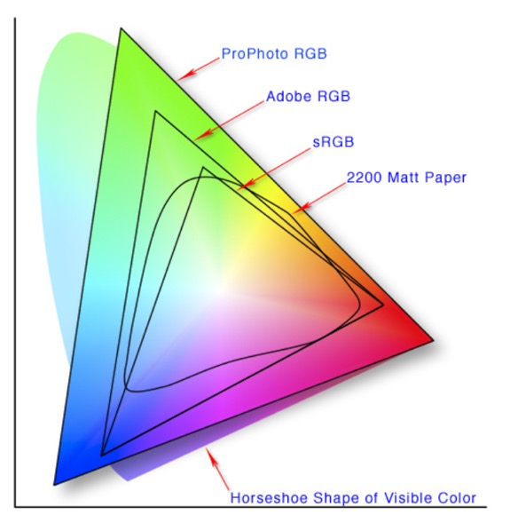
Below we can see how the gamuts of different colour spaces map to the horseshoe-like colour space of visible colours (Lab).
The first question was is how to represent this “three-dimensional colour space” in a rational way on a two-dimensional piece of paper?
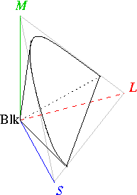
This RGB-based human colour space (called the Tristimulus colour space, which just means a colour description based upon three quantities) is a horse-shoe-shaped cone extending from the origin (black) to infinity (axes are long, medium, and short wavelength receptors in the eye). However human colour receptors saturate at high light intensities, so there is a practical cut-off at the brightest colours (furthest from the origin). In this space there is no defined coordinate for white, since it is defined according to colour temperature, from a “cool” blueish light to a “warm” yellowish light. Brown is really just orange that is less intense that surrounding colours, as is grey, which is white with a lower intensity that surrounding colours.
The original view (so-called CIE XYZ) was to try to define a colour by integrating the energy from a light source, the reflectance of an object, and the spectral sensitivity of the human eye on a per wavelength basis. This mapping of the human perceived RGB colour space was created through colour matching trials with human beings. The individual X, Y, and Z values were based on the assumption that the human eye contains three different sensors that perceive colour with different spectral sensitivities. However the XYZ space was hard to visualise, so the colour industry typically converts XYZ to chromaticity coordinates (x,y).
In order to get the colour space onto a two-dimensional page CIE transformed the RGB colour space into one that really focussed on mapping red, green and blue as hues and saturation onto the page (x,y) and placing intensity (lightness) along an imaginary z axis (this colour space is often called CIE Lab). Just as with RGB this colour space model is also able to define every colour with an (x,y,z). What we see below is just one plane, and we should not forget that the brightness of the colour as a function of wavelength is along the z axis.
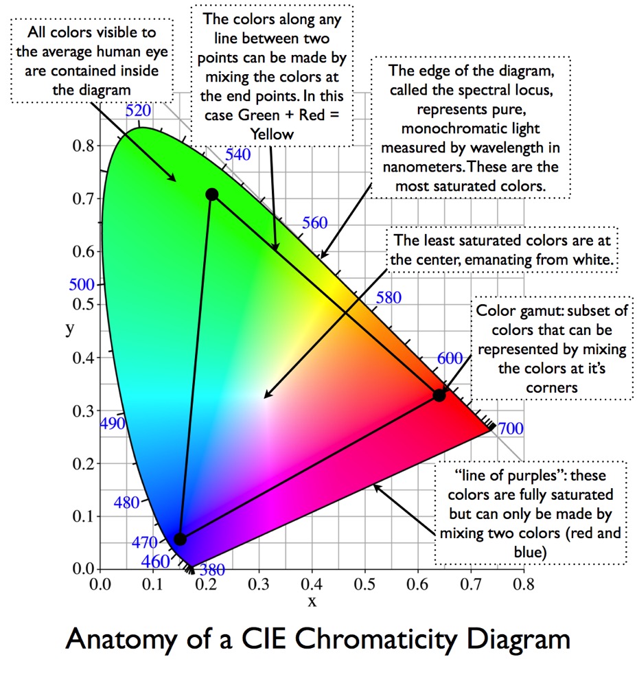
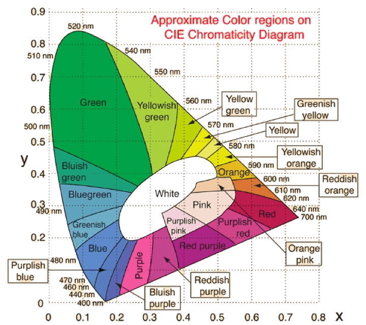
In order to avoid negative numbers this was again transformed into the below colour space. The transformation seen below is a little bit more complicated. The below colour space is often called the xyY colour space, and is a transformation of the (x,y,z) colour space to two-dimensions, independent of lightness Y (which is identical to the Tristimulus lightness value). This diagram is called a chromaticity diagram and represents all the colours visible to the average human being (excluding luminance). A new set of coordinates (x,y) are created, called the chromaticity coordinates, which are computed from the Tristimulus values (x,y,z including the lightness or luminance). You can find chromaticity expressed both in terms of hue and saturation and in terms of redness-greenness and yellowness-blueness. This curved region in the chromaticity diagram is called the gamut of human vision, and the colours on the periphery of the diagram are saturated (the most intense), and as we move to the middle of the plot the colours become desaturated and tend towards white. A practical RGB display will be a triangle inside this curved region, and as such we can immediately see that any triangle (for example, the gamut of any RGB-based display) will never be able to represent all the colours that can be seen by the average human being.
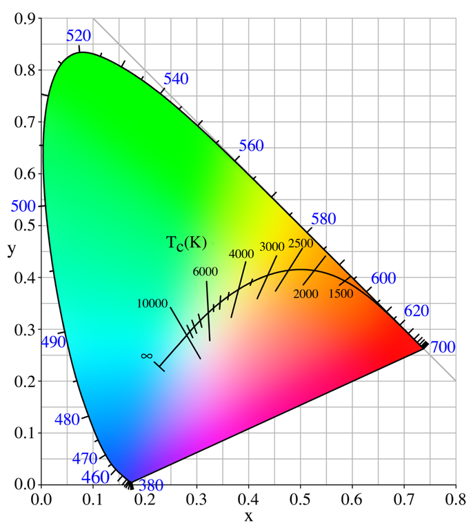
The above description came from the dot-color Website, as did the below annotated colour space.
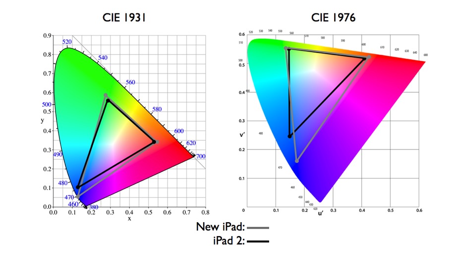
We mentioned above that the CIE 1931 standard has been replaced by a CIE 1976 standard. Below we can see the significance of this. The CIE 1976 standard colour space is more linear and variations in perceived colour between different people has also been reduced. The disproportionately large green-turquoise area in CIE 1931, which cannot be generated with existing computer screens, has been reduced. If we move from CIE 1931 to the CIE 1976 standard colour space we can see that the improvements made in the gamut for the “new” iPad screen (as compared to the “old” iPad 2) are more evident in the CIE 1976 colour space than in the CIE 1931 colour space, particularly in the blues from aqua to deep blue.
So the xyY chromaticity diagram tries to show how all the colours visible to the average person fit into a kind of twisted horseshoe-shaped graph. It shows how uneven is our human sensitivity to colours, yet at the sometime it has the advantage of being the same regardless of how it’s viewed on different devices.
What most devices actually hold as colour space information is the so-called L*a*b* colour space where L* is lightness, a* represents red/green, and b* yellow/blue. This colour space is shaped to provide a more consistent and even spacing between colours.
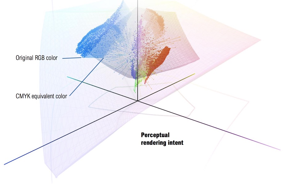
We mentioned above the problem of mapping a colour space to the physical limitations of a output device such as a printer. Below we can see a RGB colour space (large flat pink area) overlaying a CMYK colour space (the twisted pyramid in light pink). We can see that the RGB colour space is able to contain all the colours that are squeezed into the smaller CMYK colour space. What we also see highlighted are the blues that are in the RGB colour space but which cannot be rendered in the CMYK colour space (there will be reds and greens that also cannot be rendered). What we are actually seeing is the perceptual rendering diagram and how the colours are transposed in order to squeeze them into the CMYK colour space for printing. This rendering method preserves the relationship between out-of-gamut colours but at the expense of sometimes producing a less vibrant separation. Using Levels and Curves tools it is possible to retain some of the vibrancy by assigning specific values to pixels to retain shiny highlights and deep shadows.
The idea of a colour model, and the derived colour space, was originally designed to avoid learning the physics of light and the way wavelengths (colours) are perceived by human beings. In my opinion as a “simplification” it leaves a lot to be desired.
For more information on colour check out Principles of Colour and Appearance Measurement by Asim Kumar Roy Choudhury.
HP Scanjet G4010 and colour spaces
Even a very perfunctory analysis of scanning software (such as HP Scan) showed that many of its options involved colour modifications, improvements, etc. So we also need to look again at Colour Spaces.
As I have already noted, I have no idea what ‘6 colour, 96-bit scanning’ meant and how HP achieved it with its Scanjet G4010. It would not be so bad if the scanner worked perfectly and the HP scan software was of high quality. One reviewer of the scanner felt that it over saturated (“bleached”) the whites in his negatives. He also did not like the HP Scan software for negatives and slides (although it was fine for documents and photographs). Finally he noted that at high scanning resolutions the scanner added a lot of grain to the photographs.
There are a few comments describing some bits of the HP Scanjet G 4010. One person talked about the G4010 supposedly using two different kind of red, green and blue. The explanation (maybe from HP) was that different lights produce different effects on pictures and this was to correct for this. This very limited discussion appears to be based upon the so-called metamerism, or more precisely metameric failure when two colour samples match when viewed under one light source, but not when viewed under another. Fluorescent lights do tend to have this problem because they have quite irregular emittance curves. Also colour blindness is another example of metameric failure. The claim of HP appears to be that the two different lights coupled with 96-bit colour depth produced more accurate scans in terms of colour reproduction.
Independent tests done on the HP Scanjet G4010 reported that colour accuracy was better but not significantly. The idea that two fluorescent tubes will compensate for their individual spectral outputs is useful, but I could find no reports on just how useful this technique is. Even the independent tests did not describe how the HP scanner actually worked.
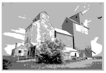
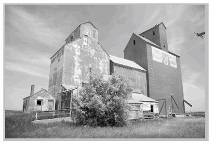
Whilst resolution determines how large the print can be, the ‘bit depth' determines how much the exposure and colour can be adjusted before posterisation occurs, i.e. this is where tones are reduced in number producing abrupt changes between one tone and another. Below we have an image with a bit-depth of 2, 5, and 8 as taken from the excellent digital training Website of Laura Shoe.
Scanners manufacturers oversell resolution, and the usable resolution is often less that 50% of the stated optical resolution. In part this is down to the fact that the lenses are not able to focus light only on to specific photosensors (some light ‘leaks’ on to nearby sensors as well), and in part on the fact that the pitch of the sensor array and stepping motor simply don’t achieve the specification stated by the manufacturers.
They also oversell bit depth, with scanners recording 48-bits (or even 96-bits), but we should be warned. For 24-bit colour we have 3 8-bit channels, each with 256 intensity levels. People mention “16 million colours” but it is impossible to discern that many colours. And it is also impossible to show on a screen or print 16 million visibly different colours. This is not to say that the extra bits are not useful, even if they are not useful for colour presentation or printing. Special effects can overlay one image over another (masks), gamma corrections for different screens and printers can use the additional bit depth, and when images go through a chain of transformations (e.g. Photoshop edits) the added bit depth can help. A sequence of Photoshop edits can produce “banding” where so much detail had been lost that smooth transitions from one colour to another are affected, producing a stair-stepping effect between colours and tones. A 48-bit or even 96-bit colour space can also have another use. In a photograph there could be areas that are too bright or too dark, and where detail cannot be seen properly. In editing, these areas can be stretched to put more distance (in the colour space) between similar colours, so that detail can be better differentiated. That can leave holes in the colour spectrum, so a 48-bit colour space will provide more colours to fill those holes (i.e. in expanding the white-to-offwhite and the black-to-offblack). Naturally this can only work if the detail is present but not very visible. Equally in stretching some colours, others are compressed (or consolidated). And with fewer bits to define those compressed colours some degradation can become noticeable. However, at the end of the day the entire image is usually then down-sampled to 24-bit for printing (and saving in a format such as TIFF or JPEG). Manufacturers claim to automatically analyse the image and select the best 24 bits for colour, but I have not found any description of how HP does this.
Generally speaking, beyond 24-bit colour depth we often enter the world of precision over accuracy. In fact, a review from a few years back noted that image quality did not directly correlate to a scanner’s colour depth or price, even if the high-end 36-bit scanners did come out on top. HP scanners were rated as average due to their excessive colour saturation (particularly in the red), although some people prefer their colours deep and vivid.
People tend to forget (or not know) that the JPEG format is an 8-bit colour format, i.e. it stores the image (captured by a camera or scanned on a flat-bed) as three 8-bit colours (RGB). In articles JPEG is mentioned as either an 8-bit and a 24-bit standard, but they mean the same thing (8-bit per colour, or 24-bit RGB). Each colour has 256 shades, and it is this combination of three sets of 256 shades that makes up the famous 16.7 million colours (which is already more colours that the human eye can see).
I have not been able to find out what colour space HP uses. However I have read that they probably use something called HP sRGB. This appears credible since it was developed jointly by HP and Microsoft (for printers and monitors). However expert users of Photoshop appear to use exclusively sRGB-IEC when going to the Web, or Adobe RGB when going to a printer. Other sources tend to suggest that HP will use a default ICC colour profile (from a vendor consortium which includes HP). The problem of colour space is not unique to HP, most manufacturers use a device dependent colour model, rather than a CIE device independent colour space. This makes understanding the performance of a scanner and comparing one to another very problematic.
Scanning in Black & White
Many experts advised that grayscale should be used for any B&W photographs, while others recommend scanning b&w photographs in colour.
Below we have three TIFF files each scanned at 300 dpi, with all options switched off. Firstly we have a colour scan (5.2 MB), then a greyscale scan (1.7 MB), and finally a b&w scan (220 kB).


B&W can be used for line drawings, i.e. something with no shades or degraded blacks. Technically B&W will be scanned at a 1-bit colour depth, i.e. a pixel is either on or off (white or black), and the scan time will be fastest, and the file size the smallest. Some experts say that line-art should be scanned at 900 ppi for printing, and 300 ppi for presentation on a Webpage. The usual format is GIF or eventually PNG. But often line-art is best scanned with a greyscale.
Greyscale is scanned at 8-bits, so containing 256 possible shades of grey (this is also the case for the HP Scanjet G4010). Many experts recommend that b&w photographs are best scanned at 600 ppi and can be saved in TIFF, JPEG2000 or PNG format, or if used on Webpages they can be scanned at either 300 dpi or 600 dpi and saved in the GIF format. Microfilm should be scanned in grayscale, however many people will want to scan such documents at up to 12-bits or 4096 levels of grey. Using grayscale it is possible (depending upon the software) to play with gamma adjustment, which can be important if the microfilm is old and of poor quality. Playing with the gamma, i.e. range of greys, can make an old microfilmed text legible. Greyscale scans take longer and the storage increases, but it is recommended in most cases involving b&w photographs, books, engineering drawings, etc. You can always create a simple b&w image from a greyscale scan (or create either b&w or greyscale from a colour scan). With many large fonts or with handwriting the details of the curves become jagged when scanned only in b&w, whereas they are smoothed when scanning in greyscale (at the same resolution). This is because in b&w the pixel can be either black or white, whereas in greyscale it can take up a number of shades, thus smoothing curves. This is particularly important for line-art that will be viewed on computer screens, where the greyscale will be smoothed with anti-aliasing, but b&w scanned line-art will look very jagged on low resolution screens. On the other hand, greyscale can be a waste of time and resources if we are scanning simple well presented, clean, type-face text. Greyscale scanning of line drawings sometimes leaves a faint grey background, and if you have control over the colour histogram you can lower the ‘white point’ from 255 to about 230 to move the faint grey background to a near white. In fact most line-art is not pure black on pure white. Changing the faint grey background will also lighten the black, so you can also move the ‘black point’ back to nearer 0. It is also my understanding that OCR (optical character recognition) works best on a b&w text, however scanning with greyscale often helps the software isolate text areas from other information on the page such as images or line drawings.
More about scanners
There are two types of people, those who have a scanner and simply want to use it to its full potential, and those who are considering buying a new scanner. I don't remember where I picked up the below discussion about buying a new scanner, but I include it here just in case its useful.
The advice was to make sure to get a scanner that included Digital ICE3 (ICE cubed). The scanner software has three tools: Digital ICE (remove surface defects), Digital GEM (automatically reduced grain), and Digital ROC (remove colour cast from faded images).
Digital ICE removes scratches and dirt from colour scans. It does not work with silver-based B&W film (although it will work fine with chromogenic film), and usually it won’t work on Kodachrome slides. In all the other cases, it does a vastly better job of eliminating dirt and scratches than any post-scanning software can.
Some flatbed scanners include a software-only version of Digital ICE, but it doesn’t work very well. Hardware-based Digital ICE performs an infrared cleaning with a second infrared lamp and a second scan. Colour film dyes (except Kodachrome) don’t absorb much infrared, whereas dust and scratches do. That gives the software the information needed to subtract dust and scratches from the scan, and it’s why Digital ICE won’t work with Kodachrome (usually) or with B&W films. Some flatbed scanners have real infrared Digital ICE, but most don’t. Apparently it is difficult to find out if flatbed scanners actually have the infrared hardware. The advice is to download the full manual for the scanner from the manufacturer’s website, and look for the instructions for Digital ICE with the warning that the software won’t work with B&W or Kodachrome film. I have found no reference to infrared hardware in the documentation for my HP Scanjet G4010, so I presume that it's not able to remove scratches and dirt during the scan.
I use the VueScan software, which claims to be able to combine the two scans and remove dust, scratches and fingerprints. The VueScan documentation does mention ICE, but I've read that it actually does not use the ICE software license, but has a custom algorithm that some experts consider to be possibly less effective.
Digital ROC (which restores colour) and Digital GEM (which reduces noise and grain) have plug-in counterparts, so it’s not absolutely necessary to have them built into the scanner. Digital ROC reads the dye signature in the base layer of faded slides and negatives and rebuilds the original colour values based upon data that is gathered during the scan. Experts say that systems that are implemented in the scanner and are used during the scan are more accurate than post-scan software. Digital GEM gathers detail on image grain during the data collection portion of the scan. Combined with information on colour and sharpness it removes the appearance of grain in the final image.